

Case study
TONIK
HTML & CSS
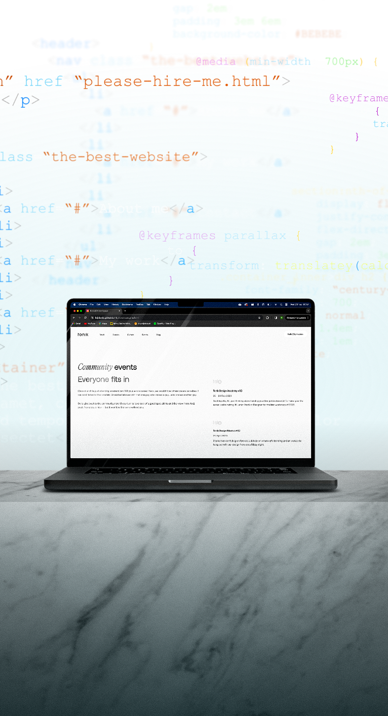
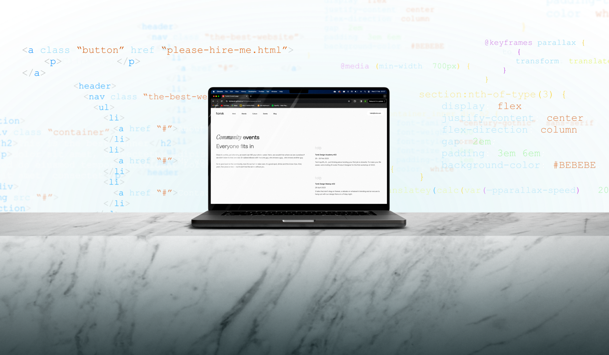
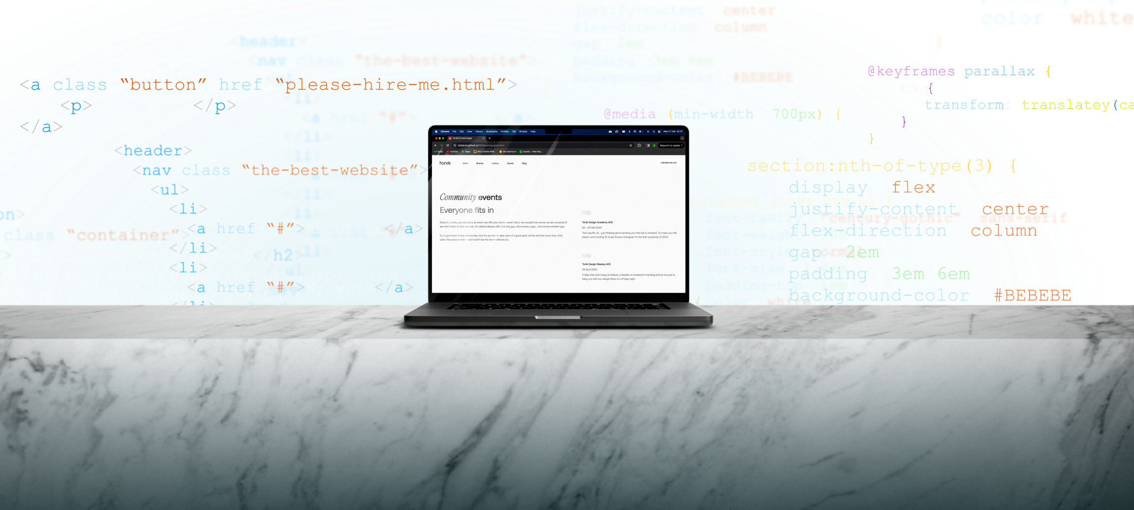
This case study showcases my ability to create a structured, accessible, and semantic website, alongside responsiveness, animations, and other unique features, all built with pure HTML, CSS, and bits of JavaScript. With this, I aim to highlight my understanding of modern semantics, the importance of inclusivity, and an overall efficient workflow.
Briefing
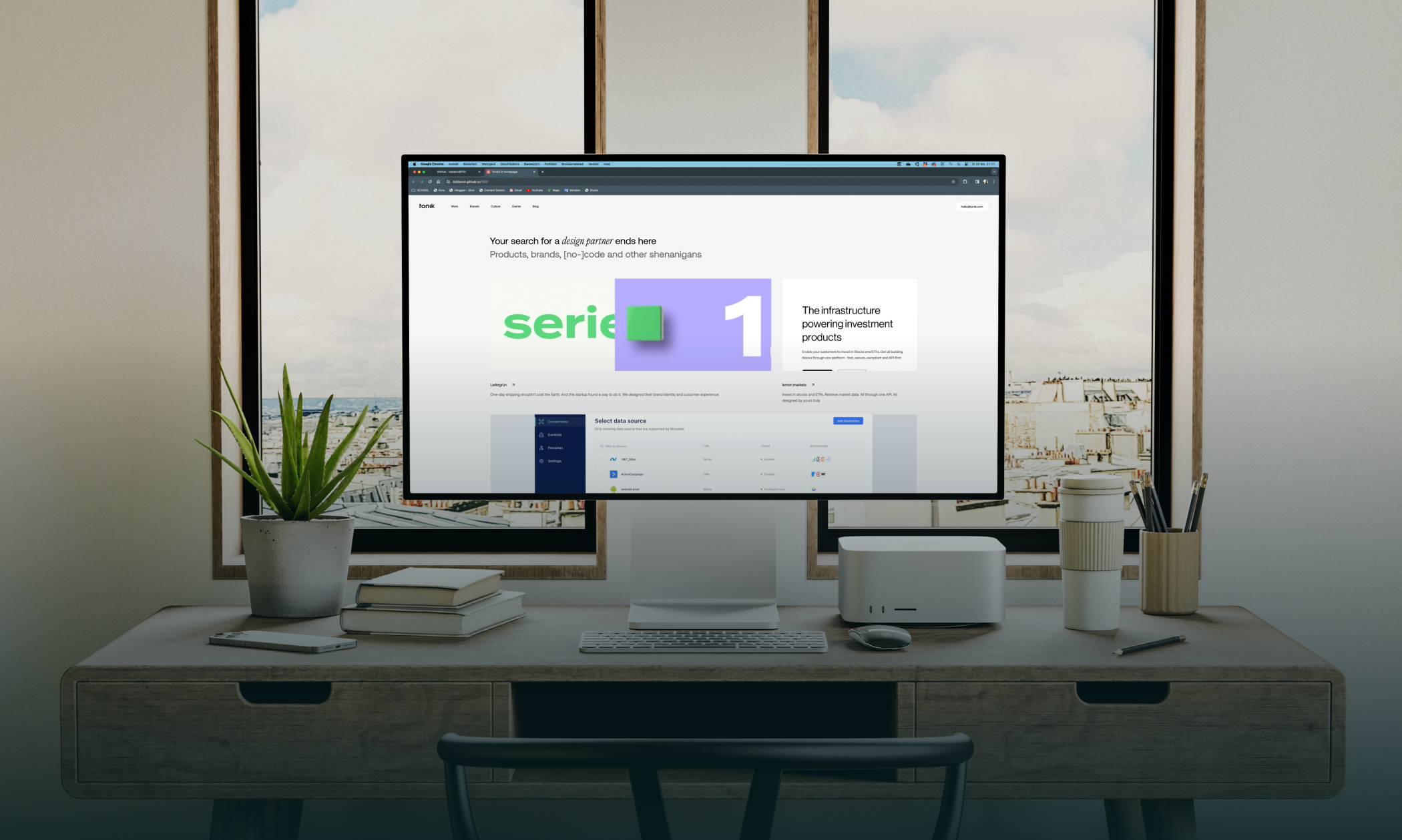
For this project, I was tasked with selecting any website with lacking or downright bad code, re-creating said website from scratch, and improving upon the code. I chose to re-create tonik.com, a design agency based in Poland. Unbeknownst to me, they have since made some changes to the design of their website, so unfortunately, the present-day comparison won't be as exact.
STRUCTURE
When creating the initial structure, I start by figuring out the basic elements needed, mainly focusing on how it's looking on mobile format. This approach makes it easier to ensure responsiveness later on.
I begin by placing all the relevant metadata for the website in the
<head> section. After that, I break down the content into sections
and subsections, using appropriate tags to maintain a clear and organized structure.
SEMANTICS
Throughout my time learning code and working on projects, I've always been encouraged to write semantic code. Semantic HTML is about using elements that carry meaningful information about the structure and content of a web page.
That means avoiding elements like <div> and <span> as
well as creating unnecessary classes or using deprecated tags. Provided there are better
suited alternative solutions.
ACCESSIBILITY
Accessibility standards are increasingly standardized across websites, so I made a conscious
effort to prioritize this aspect while writing the code. I employed various methods to
enhance the website's accessibility. These include writing semantic code (as mentioned
before), providing images with appropriate <alt> tags, establishing a
logical focus order,
utilizing aria-label's, ensuring sufficient color contrast throughout, and
creating a
responsive design.
RESPONSIVENESS
Responsiveness refers to the ability of a web page to adapt and display effectively across different devices and screen sizes. To achieve this, I utilize both flexbox and CSS grid.
Additionally, I implement a @media query at 700 pixels to ensure the design
converts
seamlessly to a mobile view, resulting in a fully responsive design.
ANIMATION
A crucial aspect of bringing a website to life is animation. Therefore, I consider
understanding animation to be an essential skill for developers. I apply a lot of animation
throughout the page, particularly when hovering over elements. To achieve this effect, I
utilize the :hover pseudo-class.
QUIRCKS
With the core HTML and CSS in place, it's time to focus on the finer details. I'd like to take this opportunity to highlight some cool tricks I've learned along the way. In this example, I use the invert filter to change the natively black logo and hamburger icon to white whenever the menu is opened.
HTML
CSS
DETAILS
